Inspiration, News, Tips and Advice
Typography trends for 2019 – say hello (again) to the serif
Fleetwood Mac are in the album charts; oversized flares are everywhere mustard is creeping into everything from accessories to home décor and crazy patterns are taking over. No, we’re not watching an old 70’s movie. We’re talking 2019. From Art Prints, to Posters and Cards, retro-inspired typography is creeping into every element of stationery design… have you experimented with it yet?
Not only does our fashion seem to be taking a dive back in time, serif fonts, once shunned and considered old fashioned, are back. 70’s inspired fonts, bold drop shadows, chunky serifs, they’re all in – and they’re everywhere.
If you’ve stuck to your Helvetica guns, now’s the time to break free. Let’s embrace the fun side of typography! No longer are we confined by boxy, bold typefaces – bubble fonts, colour pops and outlines are back – and that means it’s time to have some fun.
Create your own retro-inspired designs at Printed.com
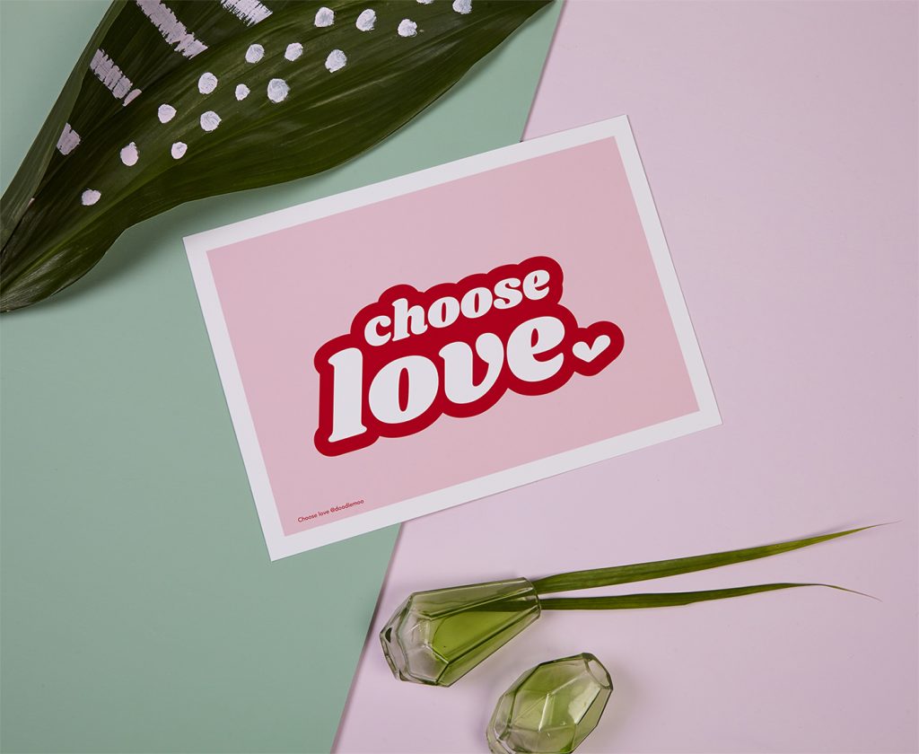
The best way to use serifs in typography is to pair them with a simple design for maximum effect. A bold, chunky serif font on a plain background looks great on a Greeting Card or impactful print.
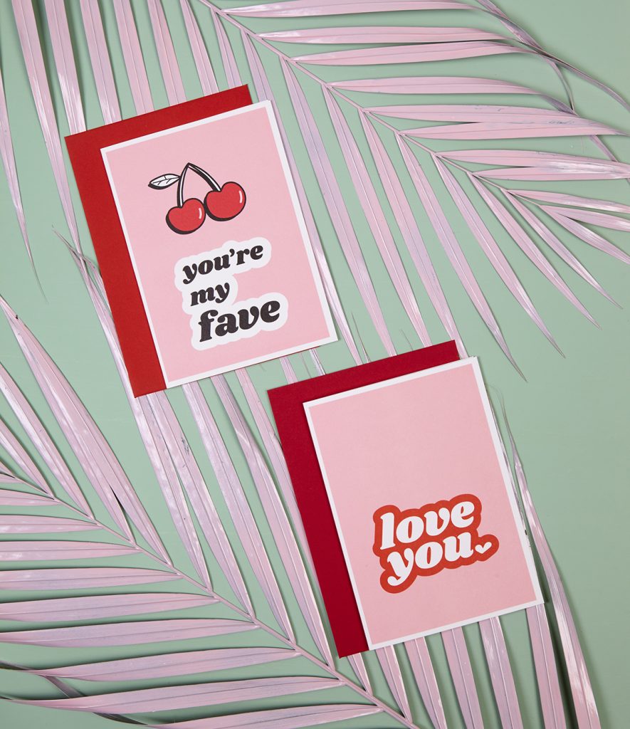
We love how Doodle Moo has used an outlined serif font for a retro, yet modern feel for these adorable pastel-hued cards.
It’s important to keep the design simple and let the typography speak for itself. This is key to ensuring your retro-inspired fonts aren’t lost, or appear too cluttered – just like DoodleMoo!
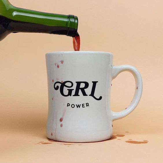
Teaming a serif font with a sans serif brings a modern edge to what could be considered a dated font style.
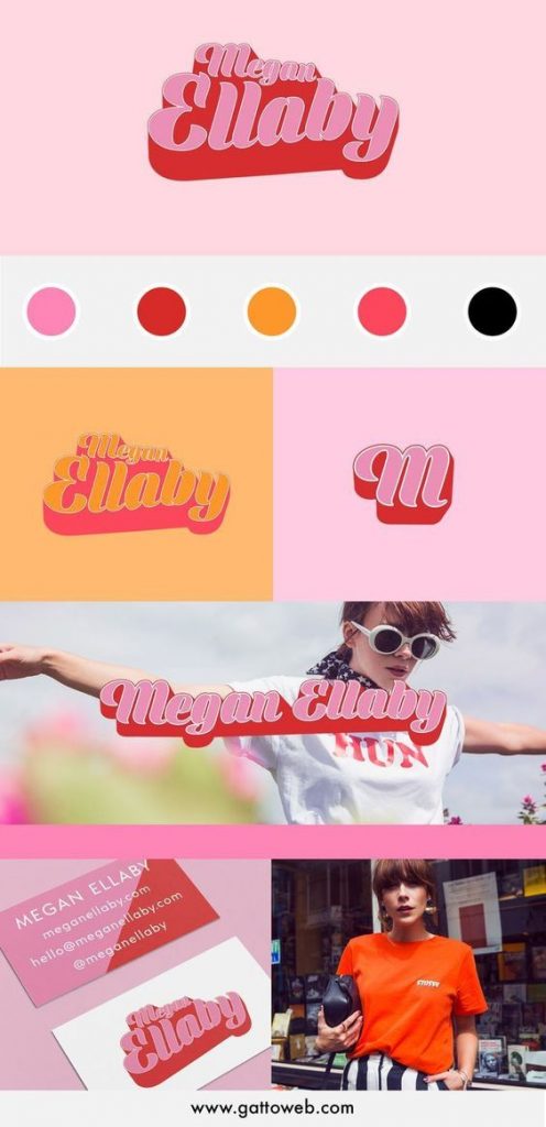
If you’re choosing a retro style font, why not go the whole hog and team it with a retro colour palette for your typography like Megan Ellaby?
If you’re thinking about taking a trip back in time with your type, we’ve got a few tips for making it work.
Make your font the focal point in your typography
A bold, chunky typography is a design element in itself – it can stand alone on the simplest of backdrops. There’s no need to overcomplicate it, have fun with your font and keep the rest simple.
Play with colour
70’s and retro-inspired fonts are fun! Team yours with colours, outlines, shadows, textures and really dive in to the creative possibilities.
Be brave with your typography
If you’re a diehard Helvetica designer, branching out into something a little different is daunting. But with the right technique, a retro inspired font could lift your designs in ways you never thought possible.
Feeling inspired? Whether you’re creating Art Prints, Posters or Cards, we’ve got everything you need to bring your retro design to life. Why not experiment with Foiling to add an extra pop to your designs? Or how about adding a subtle texture?


