Missed out on the UK’s leading retail fair- Top Drawer 2020? Don’t panic! We’ve got the inside scoop for you right here.
Important Statistics
Steps walked: 45,000
Brands Exhibited: 1,500
Customers met: 11
Award winners congratulated: 3
3D printed pens collected: 2
The three days spent at Top Drawer were BUSY. From Cards to craft beer, gin to giraffes, every corner you turned there were new products to try and an explosion of designs to enjoy. If you couldn’t make it, we’ve rounded up some of the key trends we saw while we were there!
Key Trends at Top Drawer
Every year, Top Drawer partners with design experts to highlight the key retail trends of the season in their Trend Café, so you can make sure your designs are on the cutting edge. Let’s get you inspired.
Rare Bloom
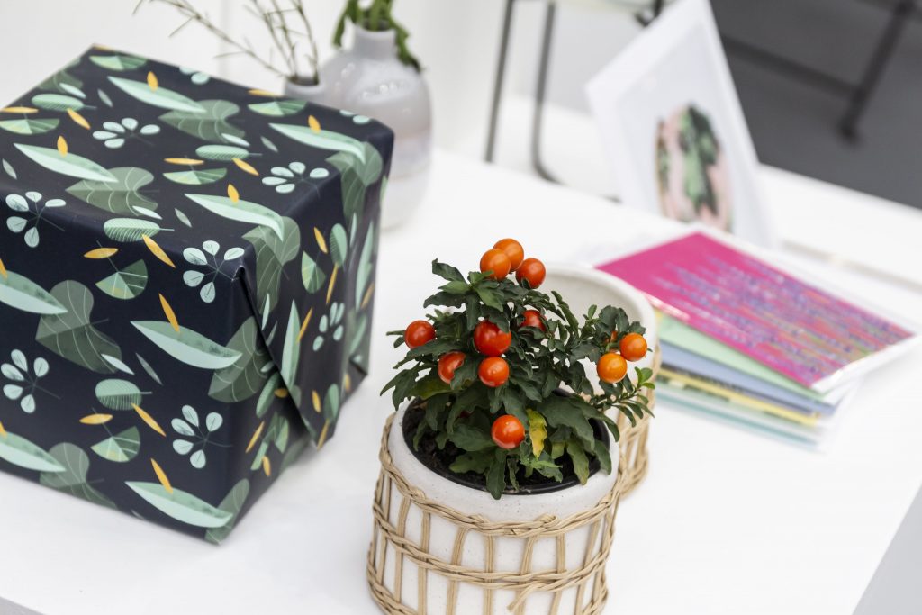
Spring might seem like a long-forgotten dream at this point, but florals are back in a big way this season.
What is it?
Bright pigmented flowers paired with soft earthy shades captures all the beauty of a botanical garden, giving a relaxing yet powerful edge to designs. Popular retailers like Gin in a Tin and Garden Trading have already taken advantage, pairing deep colours like reds, purples and oranges with acidic lime greens and gentle corals to create a masterpiece of colour.
How can I use it?
Such a floral trend is cropping up more and more in stationery, giving an interesting pop to Envelopes and paper. While summer might be far away, you can still enjoy some tropical fun in your own designs!
Unadorned Tactility
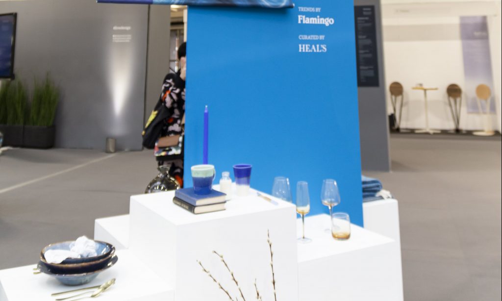
Blue is THE colour to use this season.
What is it?
Even before Classic Blue was named as Pantone’s Colour of the Year, we’d seen it cropping up in print design all over the place. And nowhere is the versatility of this colour showcased better than with this trend.
Focused on finding new ways to use traditional materials for the new decade, the blues and greens that dominate this colour palette only highlight the beauty that can be found in nature.
How can I use it?
Used by brands like Bloomingville and CWC Ceramics, they showcased how deep blues and geometric shapes can make Product Labels pop and bring a more refined edge to design.
Playful Chromatics
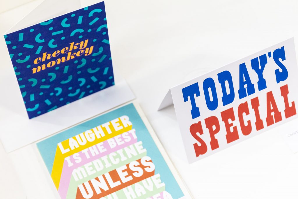
For designs bursting with colour, this is the trend for you.
What is it?
The rainbow palette of bold block colours gives a fun modern edge to designs. Using a mix of different materials helps saturated the various hues giving a much richer visual experience.
How can I use it?
Showcased expertly by brands like Disco Dust and Izipizi in the Trend Café, vibrant mixed hues made a great addition palette for all sorts of print. From brightening up Wedding Print to creating something a little different for your Business Suite, inspire your designs with the rainbows of this trend.
Serene Warmth
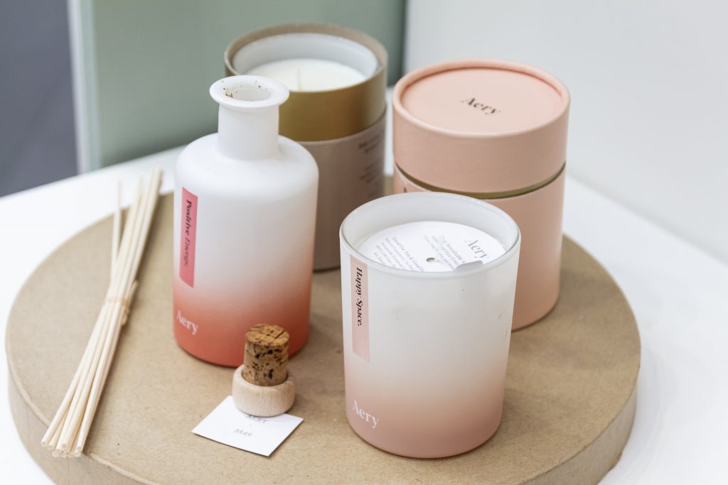
Explore the cosiness of late afternoon warmth with this trend.
What is it?
Characterised by a muted nudes and oranges, this soft theme takes inspiration from the richness of luxury materials and smooth stones. This trend brings a touch of glamour to design while giving off a naturally relaxing vibe.
How can I use it?
It makes the perfect choice for Postcards and packaging and showcased by brands like Neu Oil and Wolf & Moon.
Refined Elements
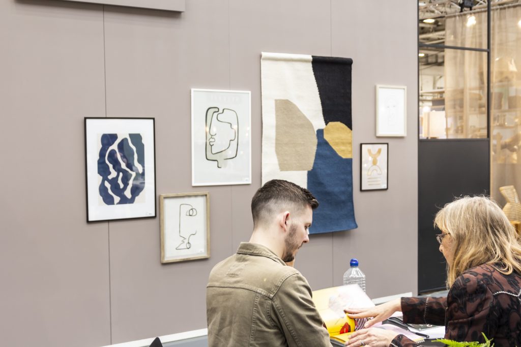
For something minimalist, try the refined neutral palette of this trend.
What is it?
Focussing on soft greys greens and blush, it stays soft with smooth textures and circular patterns.
How can I use it?
For print, this trend works especially well on thicker, more textured papers like Tintoretto Gesso.
Itching to find out more about Top Drawer 2020? Soon we’ll be covering some of the amazing customers that we caught up with there as well! Stay tuned to find out how much they loved the event as well as their top tips for creating a succesful exhibition space
Oh and be sure to keep an eye on our social feeds too, we’ll keep you posted with all the latest updates.
