#ProudlyPrinted, Tips and Advice
#ProudlyPrinted – The Monochrome Edition
Spring may have sprung and pastel hues, botanical brights and carnival colours are everywhere… But, we’ve noticed a trend amongst the colours. Proving that less is sometimes more, monochrome is reigning strong when it comes to print! Check out just a few of our favourite designs to pass through our presses, all with a black, white and grey theme.
I Do Invites
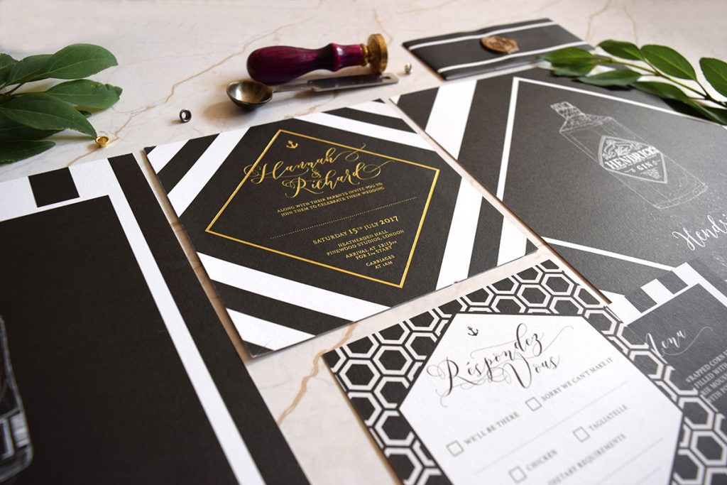
Image credit: I Do Invites
Geometric patterns and a flash of gold makes these gorgeous invites by I Do Invites really stand out. We can also spy a cheeky bottle of gin too, and that means that all of our favourite things are encapsulated in this one photo! Win win!
Pixel and Ink
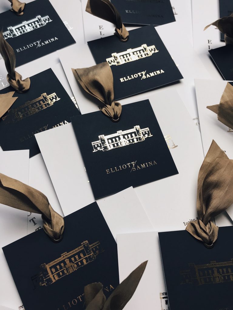
Image credit: Pixel and Ink
The eagle-eyed readers among you may recognise the name ‘Pixel and Ink‘ from an interview and article we did a while back… Well, we’re super excited to welcome Pixel and Ink back to the Printed.com Blog, this time with some breathtakingly beautiful monochrome and Foil designs! Simple, stunning and finished with gorgeous ribbon, they certainly set the tone for a sophisticated day ahead.
Make Do Drink
Image credit: Make Do Drink
When we saw these stickers appear on our #ProudlyPrinted feed, we simply had to know more – so we asked Nicola Darwen (designer at Make Do Drink) what they’re all about…
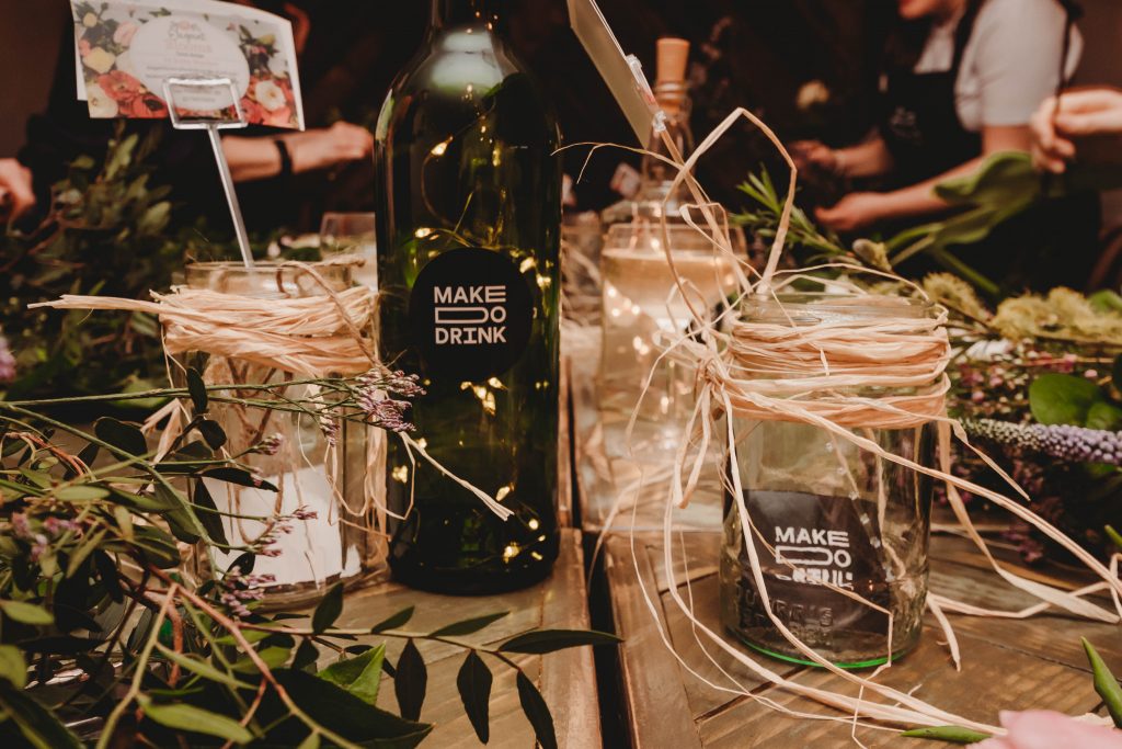
Image credit: Make Do Drink
Cairn and Grace
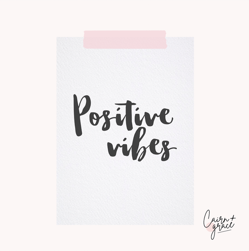
Image credit: Cairn and Grace
Keeping it beautifully simple, Cairn and Grace‘s positive vibes have got us feeling the monochrome love! We love the combination of bold calligraphy on beautifully textured paper for the ultimate finish.
About Face Illustration
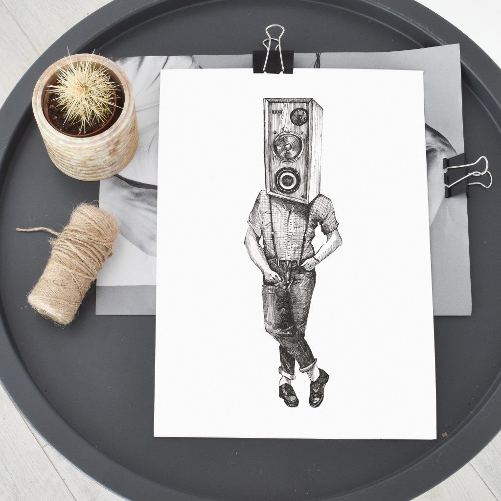
Image credit: About Face Illustration
These stunningly unusual prints are courtesy of About Face Illustration. Set up by Paulina Kwietniewska when she was on maternity leave with my first child in March 2016 – it’s became a full time job ever since (and we couldn’t be more glad). All of Paulina’s work is created using variety of mediums, including watercolour, oils and ink – and her prints are reproduced by us at Printed.com on 280gsm Nettuno paper.
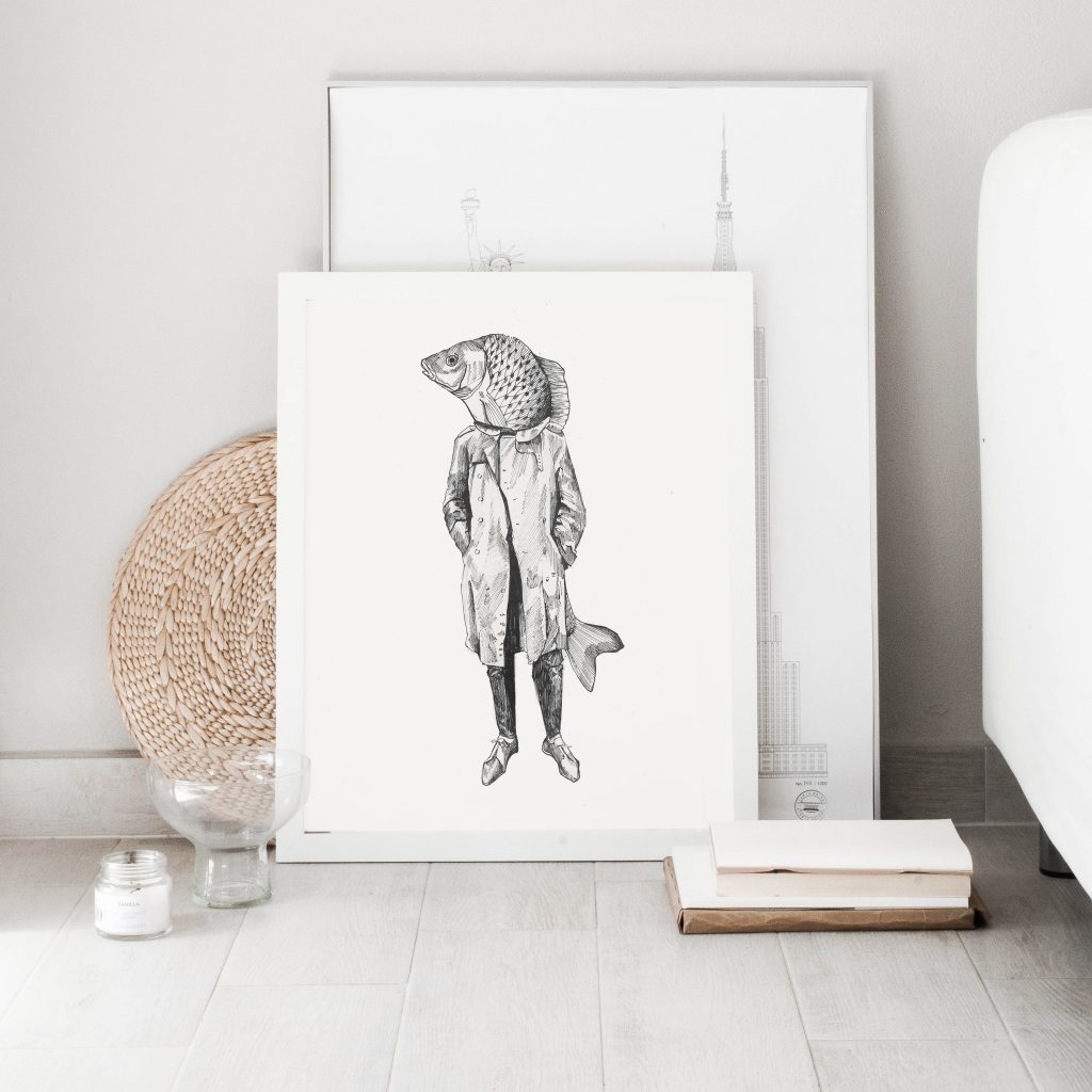
Image credit: About Face Illustration
Amy Frank
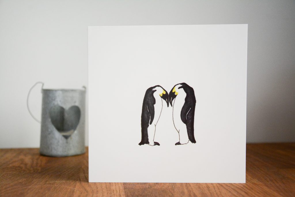
Image credit: Amy Frank
We love the delicate simplicity of this gorgeous penguin card by Amy Frank. Symbolising so much more than just penguins, Amy shows us how to nail the simplistic designs, proving that less really is more. This card doesn’t need anything else – it’s perfect as it is!
Dan Hill
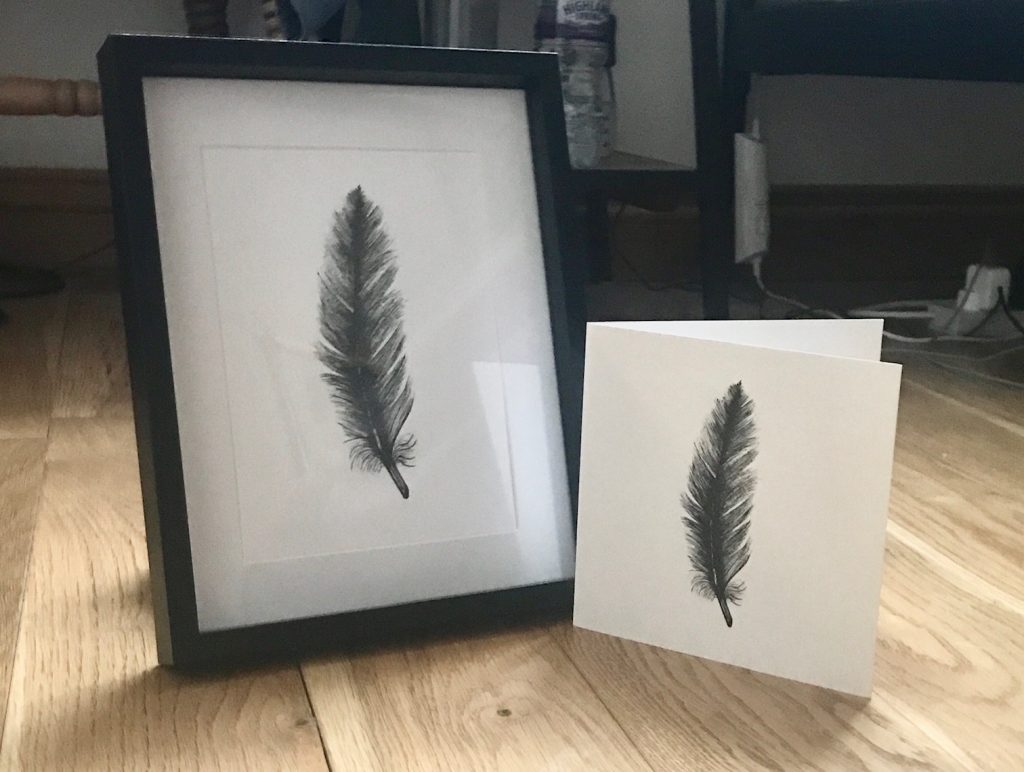
Image credit: Daniel Hill
This beautiful feather print originally began life as a painstakingly detailed, hand drawn pen illustration by Dan Hill. Pen stroke drawings like this one, and his other creations, are where monochrome really comes to life – if you don’t believe us, check out his Etsy page!
Francesca Norton Wedding Stationery
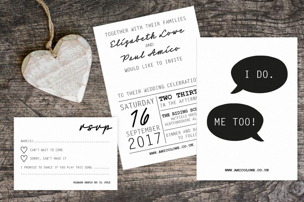
Image credit: Francesca Weddings
We love Francesca Norton Wedding Stationery‘s modern take on her Save the Date, Invite and RSVP above. In simple black and white, with a mix of contrasting, yet complimentary fonts and styles, it makes the perfect choice for a modern and fun wedding.
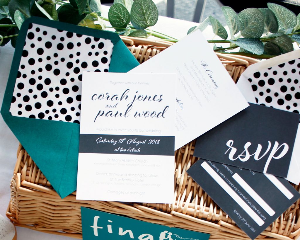
Image credit: Francesca Weddings
If the idea of going all out monochrome is a bit much for your Wedding Stationery, take a leaf out of Francesca’s book and team yours with a bright and colourful envelope for an added pop of colour. We love the extra addition on a patterned Envelope Liner to add a little extra to this gorgeous suite.
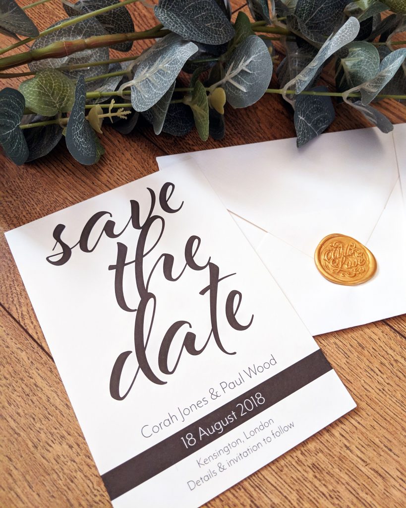
Image credit: Francesca Weddings
We hope you enjoyed our #ProudlyPrinted – The Monochrome Edition
Remember, if you fancy a slice of the action, just tag us in your printed creations over on Facebook, Instagram and Twitter and use the hashtag:
While you’re here, why not check out some other #ProudlyPrinted creations with our Colour Trends and Invite Only edition?
