Inspiration, News
Tips and trends from the London Stationery Show
The London Stationery Show is the UK’s only trade event dedicated to stationery, showcasing the biggest selection of writing and paper products from around the world. And on the hottest day in London so far this year, our Content Team decided it was too good an event to pass up!
So, if you didn’t get the chance to head along to the show, fear not. We’ve listed some of the top trends and tips from the day so you don’t miss out. From 2023 colour palette trends to cross-channel content tips for small business – read on to get inspired.
Content Strategy with Rachel Waring
We attended a fantastic talk by Creative Consultant Rachel Waring. She had some insightful tips for small businesses showcasing themselves across social media. We loved the following tips in particular:
- Choose your platforms carefully (you don’t need to be everywhere!)
- Use ‘power platforms’ relevant to your brand and industry
- Experiment with different content themes that categorise your posts
-
- Product photos, best sellers, collections
- UGC, customer videos, influencer content and testimonials
- Gifting guides, how to’s and desk inspiration
- Behind the scenes, getting to know the team
- Squeeze every last drop from all content you produce, and use it across multiple channels
- It’s okay to repurpose top performing content across other relevant channels (for example, pinning a high performing product reel on Pinterest!)
Rachel really is all about bringing the fun and joy into content creation – something that we full embrace here at Printed.com. But don’t just take out word for it… our TikTok speaks for itself.
Selling on Instagram with Therese & Elizabeth
Whilst at the show, we also popped our heads in on a talk by Therese Oertenblad and Elizabeth Stiles about how to sell on Instagram. Their angle was very much lead by ‘selling with soul’ in order to grow your community and revenue. These were some of our top takeaways:
- Be your authentic self on social
- Tell a story with your posts, and think about a beginning, middle and end to what you’re trying to say
- Let people into your world and talk about yourself (show your face!) – this helps build trust with your brand and extends your comfort zone
- Do what suits you, don’t just jump on trends for the sake of it
- Document, don’t create. Video is 100% the best way to do this!
- Show the unpolished behind the scenes of your business. Perfectionism isn’t respected
We’ve loved Therese and Elizabeth’s focus on storytelling, and definitely enjoy creating our own behind the scenes videos here at Printed.com. We especially love it when we can feature our customers, so get in touch with us if you’d like to collaborate.
2023 palettes with Colour Hive
Last but not least, we attended an extremely interesting talk hosted by Colour Hive, who presented their global colour, material and finish forecast for Spring / Summer 2023. This type of information is invaluable, especially to help inform design concepts ahead of new seasons.
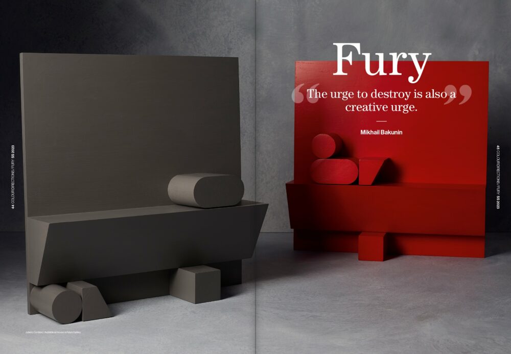
We were particularly captured by two of their colour palette forecasts, focusing on two themes; ‘Fury‘ and “Kingdoms‘. Here’s what we found out:
Colour forecast: Fury
- This theme suggests immediacy, energy and unrefined statements
- The palette is made up of black, white and red
- It is also inspired by 80’s cult graphic design and bold typography
- Texture associated with this palette are industrial and mechanical
Colour forecast: Kingdoms
- This themes suggests maximalist, eclectic and performative styles
- The palette is much more discordant with multiple primary colours involved, but the chosen combinations emulate the intensity of this theme
- It is also inspired by real-world applications and retro moods
- Textures associated with this palette are tactile and layered to bring focus to free spirit, play and process
There is a whole world of colour to explore with the experts at Colour Hive, for more information on how to access these you can head here.
Exhibition stand inspiration
Now we couldn’t round up the London Stationery Show without calling out some of our favourite stands now could we? Exhibiting your business in public can be daunting, but here are some highlights from customers who simply nailed it:
Sister Paper Co
- We bumped into our customer Emma, who was showcasing her beautiful stationery collection of Greeting Cards and Wrapping Paper. We loved the lifestyle theme of her stand, bringing in furniture to make it feel like a room in her house that she was inviting you into. Genius!
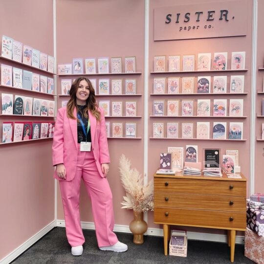
Image credit: Sister Paper Co on Instagram
Tom’s Studio
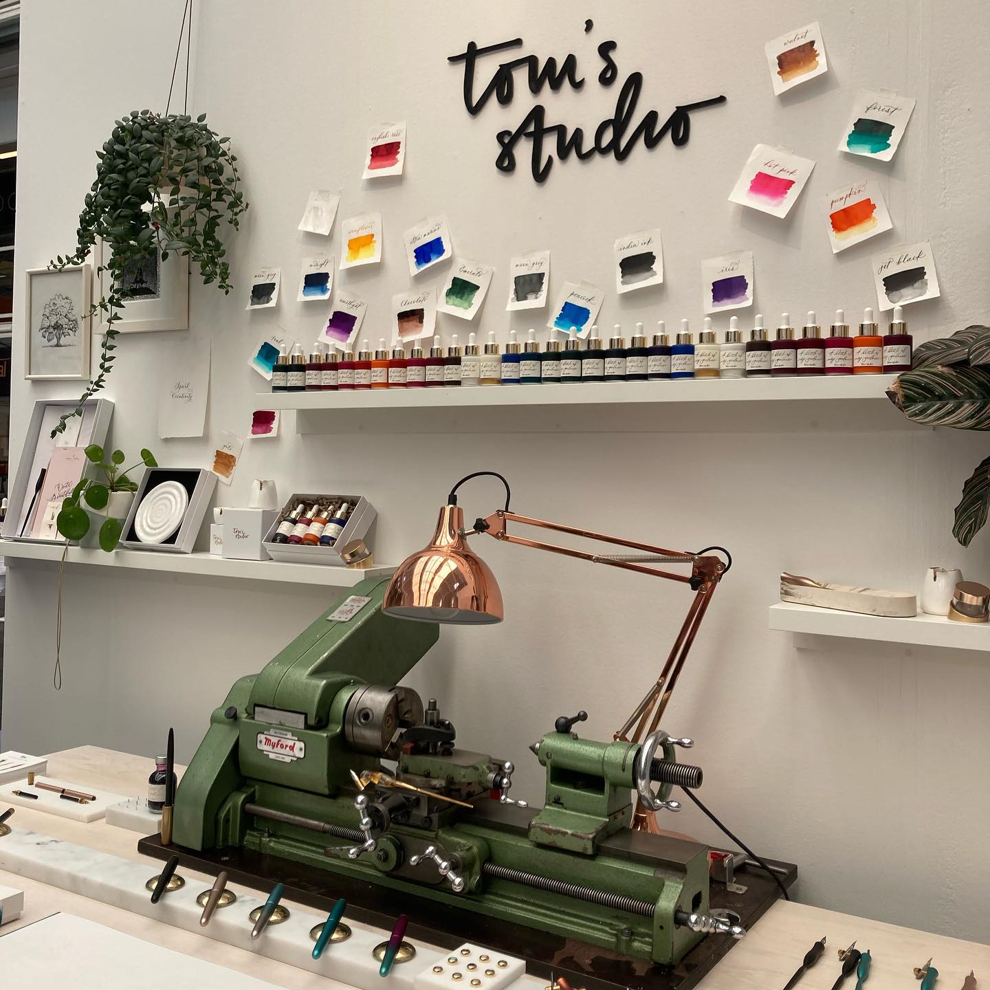
- Tom of Tom’s Studio is a designer and craftsman making extraordinary creative tools. We were lucky enough to get to have a play with some of his calligraphy pens which were absolutely stunning. The experiential elements of his stand meant that you simply had to stop and see what all the fuss what about. (Turns out we want to buy ALL his stuff now).
Gabi and Gaby Design
- We also stopped by Gabi and Gaby’s stunning stand, who was a winner in the London Stationery Launchpad campaign. What we loved most was how she exhibited her Wrapping Paper products, having physically wrapped gifts attached to her wall space. A great way to show how your products look in a real use case scenario.
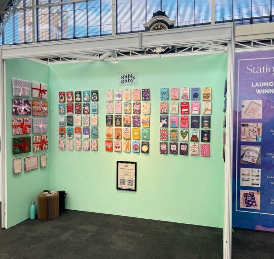
Image Credit: Gabi & Gaby on Instagram
So, there you have it! Thank you London Stationery Show for continuing to inspire us, and host our incredible customers. We’ll be back next year bringing you all the hot topics from the show. In the meantime, don’t forget to check out our other exhibition, and trends based content for 2022.

