Tips and Advice
How to create a great window display
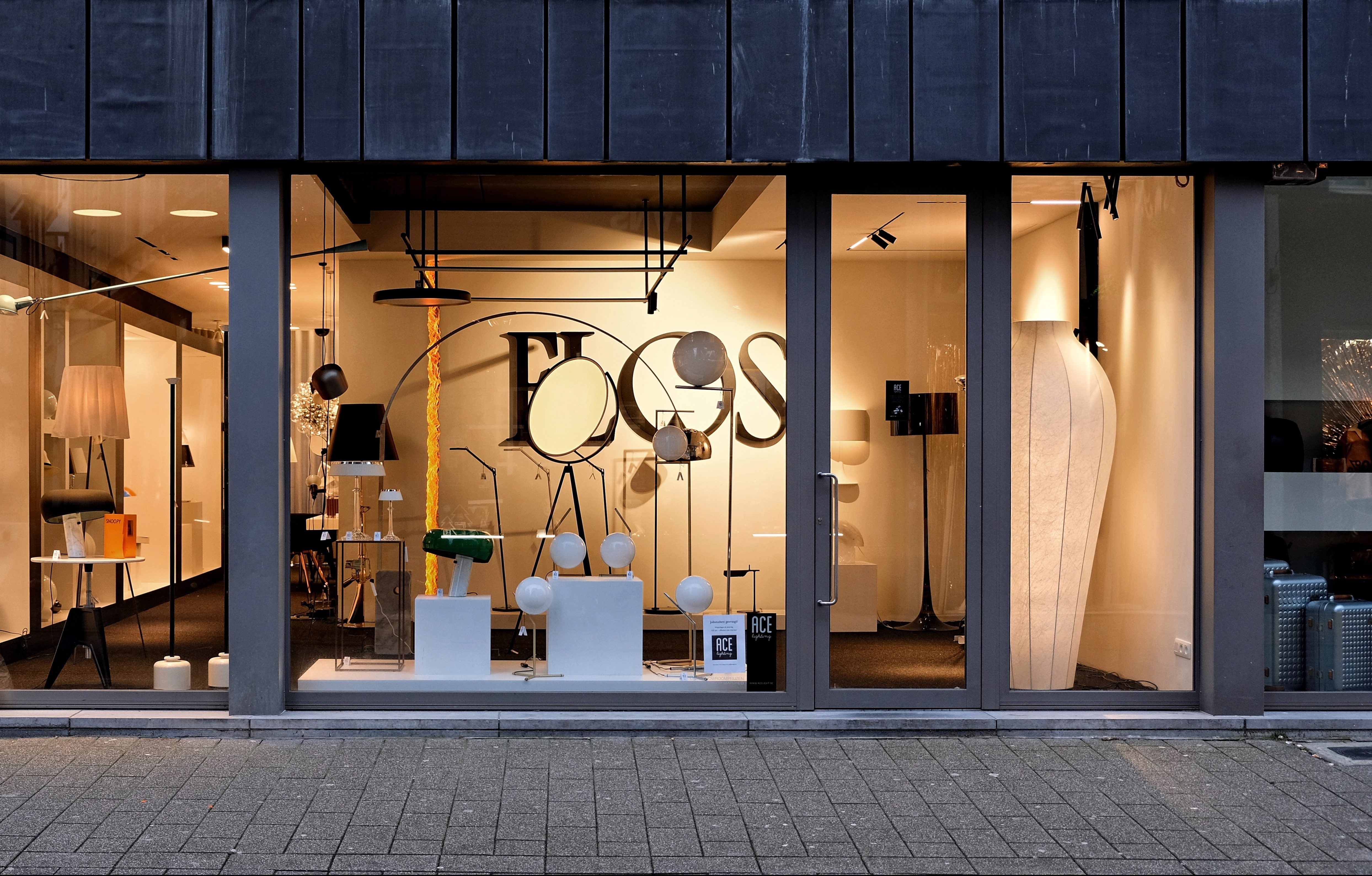
Retail is incredibly competitive, and will be even more so in the current Covid-19 climate. A strong window display can help bring in those crucial customers to your business, but how do you grab attention? Our in depth guide will take you through planning, creating and executing your next wonderful window display.
What’s your window display objective?
Your first consideration should be the purpose of your window display. This may sound obvious, but your objective could be to simply show that you have reopened for business, or to showcase your revamped product range to heighten brand awareness after lockdown. It will likely be a combination of the two initially, and once you have your aim locked in, you need to draw a rough sketch of what you want to create. This will also help you decide on any props or decorations that you may need to order.

Choose your theme
The next thing to think about is the theme of your window. If you’re going seasonal, go strong because customers will be seeing summer displays everywhere. Dare to be different! As an example, don’t just think sunshine and ice cream, think of a story entwined into the changing of the season, such as staycations or garden parties. It’s really up to you to decide what feeling you want your store to have, but try to evoke emotion in your display however you can.

Have tools ready for the job
It sounds simple, but there is nothing worse than finally getting stuck into your brand new window display and realise that you’ve forgotten your tape measure. When you’re ready to get creative, don’t forget to bring along the following essential tools for the job:
- Tape measure
- Scissors and utility knife
- Glue, glue gun and tape
- Stapler
- Hammer and nails
- Screwdriver and screws
- Stationery – pens, pencils, paints etc.
- Extension cords and batteries for lighting
- Vacuum cleaner to sort out the mess you make
- All the props!
- Window cleaner fluid and cloth for a spruce up
Create a focal point

The best thing to do here is take your rough sketch, step outside to look at your window and decide where the customer’s eye will be drawn to. This will be your focal point. Mark this area on your sketch as this is going to be where you put your main selling point or centre of your branding. Using this focal point, consider the shapes, lines and arrangements the rest of the window will need to make to show off your work to its fullest.
Heights and lights
These two components are crucial for all retailers wanting their window display to reap in the sales. You need your most important, relevant stock in the focal point, and at the right height for customers to take it in properly. For example supermarkets tend to keep their bestsellers and promotional items in the middle of shelves, with lower priced and less popular produce right at the bottom or top so there’s more effort involved in retrieving items.

Lighting can be crucial in getting people to stop and look at your window display. The ways you can use lighting are endless, but we recommend using lighting to draw the eye to focal points and products. Lighting installed from the side as opposed to directly above stops dark shadows being cast, and will really bring out the shapes of your products.
Balance your space wisely
Make sure you get the balance right in your window. If you have a big window, then you can afford the space to have a more detailed display, but the smaller you are the simpler it needs to be. Otherwise, potential customers won’t be able to focus on a cluttered window and may walk by.
Use print to the fullest
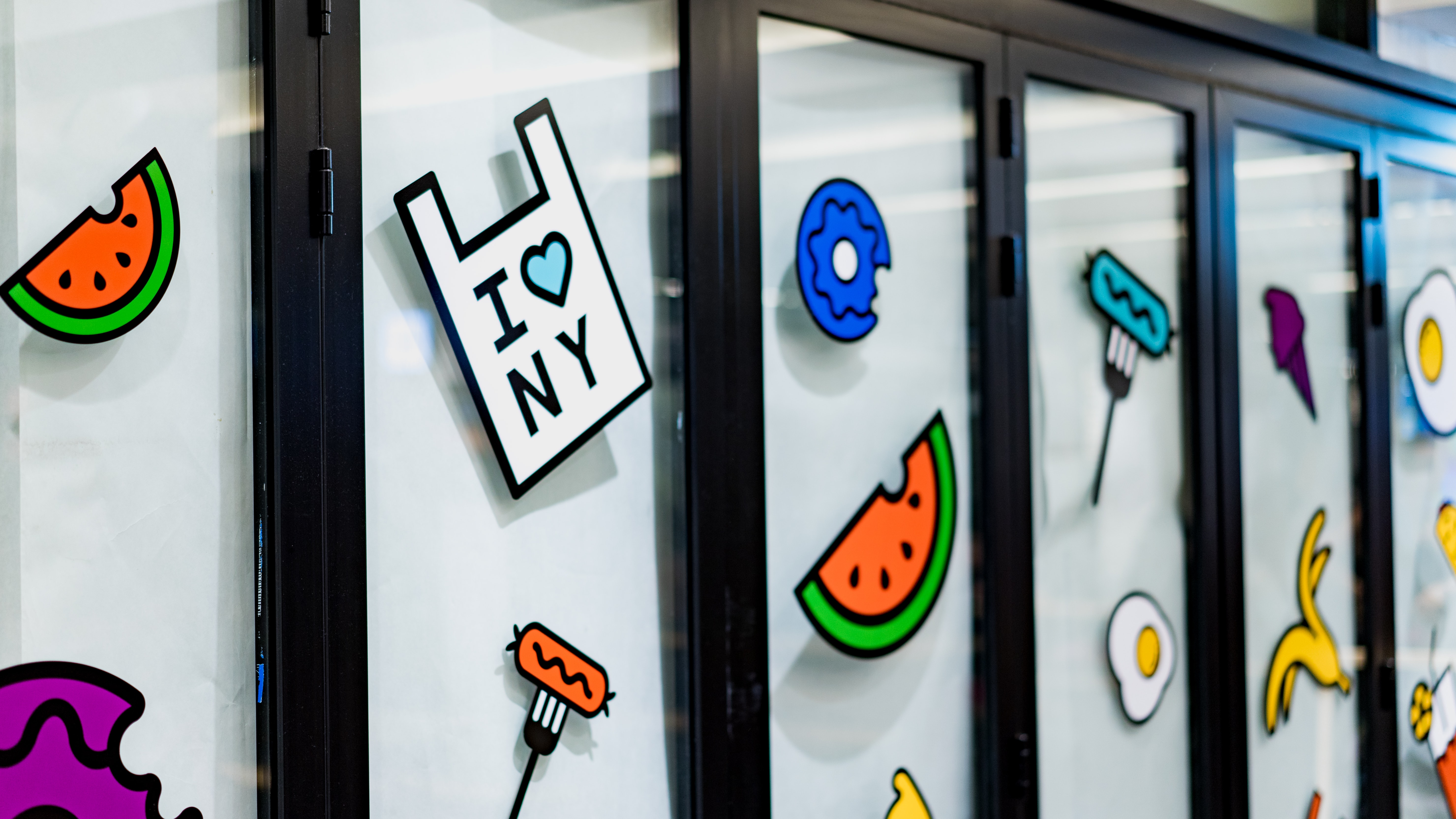
This is where we can help! Self-adhesive Vinyls are stickers that can be removed and repositioned on your windows and in-store. If you have a new promotion or sale to shout about, a good retail window or wall decoration will certainly turn heads. You may also want to use products such as Strut cards on tables and shelves to display sales messaging, and Roller Banners can be used as backgrounds to transform your space.

Transfer your learnings online
While the above advice is mostly for physical stores, online merchandisers can take a few pointers here too. Having white space on your site to separate products and pages is just like spacing your window out evenly. Your home page sliders and product images need to be strong and still have that key focal point, and even though you’re online, you may want to print out Brochures and Business Cards for any potential networking or pop-up events over the coming months.
Good luck with your next window display, and don’t forget to share your photos with us online by using the hashtag #ProudlyPrinted!
