#ProudlyPrinted
#ProudlyPrinted – The In Bloom Edition
With spring in full swing and gorgeous flowers at the recent Chelsea Flower show still etched into our memory, we thought we’d take a look at some blooming lovely customer artwork this week – all with one central theme, fabulous florals! Florals are hot right now, and we just love seeing how you guys use ‘em, so here’s just a snapshot look at some of our faves.
From gorgeous handcrafted designs to cutting edge modern minimal, we get to see all kinds of creative pieces pass through our presses. Want to see your designs here too? Tag on social using the hashtag #ProudlyPrinted!
Alice Perry

Image Credit: Alice Perry
Alice Perry keeps is clean and simple with her contemporary take on foliage. Printed onto textured stock her simple Christening invites are packed with classic charm.
Half Pint Print

Image Credit: Half Pint Print
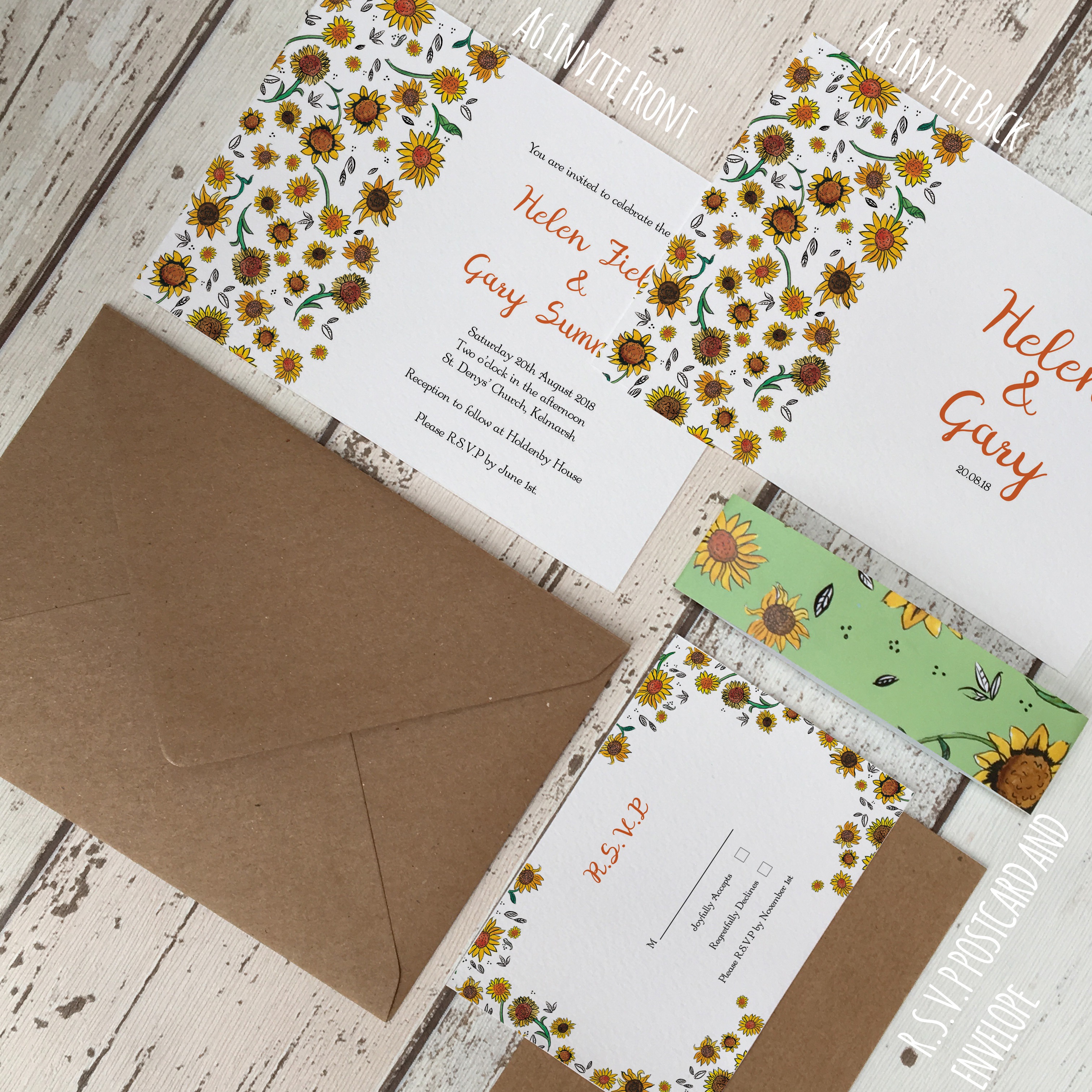
Half Pint Print is well and truly bringing the sunshine with these adorably illustrated Wedding Invites and RSVPs, with complimentary Kraft envelopes and delicate Belly Bands.
Anna Gwenlian

Image Credit: Anna Gwenlian
How cute are Anna Gwenlian’s illustrated cards? We love the simplicity of her gorgeous hand-drawn floral elements and simple typography. We also love that’s she’s true to her roots with these cards being exclusively written in Welsh.
Bea and Bloom

Image Credit: Bea and Bloom
Bea and Bloom are flipping the norm on its head, choosing a coloured background to offset her gorgeous white illustrated blooms. The overall feel is contemporary, clean and chic, ideal for a spring or summer wedding!
Harriet Rachel Studio

Image Credit: Harriet Rachel Studio
Florals love watercolour and watercolour loves florals! That’s just one reason why Harriet Rachel Studio’s birthday card designs work so well. The delicate colours meld seamlessly together, and paired with a Kraft envelope, they’re the perfect package!
Harriet Ruscoe

Image Credit: Harriet Ruscoe
A feast for the eyes here from Harriet Ruscoe – we almost feel like we’re back at the Chelsea Flower Show with this vibrant array of floral designs. Bold brushstrokes, popping colour and simple typography make her cards a work of art in themselves!
Let Love Sparkle Designs

Image Credit: Let Love Sparkle Designs
Kraft is always the paper of choice when you’re looking for a handcrafted look and feel – and pairing this warm, rustic paper with hand painted elements is a guaranteed match made in heaven.
Jones & Joy

Image Credit: Jones & Joy
Rich, dramatic hues offset the floral elements in Jones & Joy’s Wedding Invite sets. Complete with printed Envelope Liners and matching Belly Bands, this is one invite that won’t get lost in the post!
Blue Hour Paper

Image Credit: Blue Hour Paper
We’re feeling tropical thanks to Blue Hour Paper’s aqua palm print designs. While not a floral as such, botanical prints are key for the summer season, and we think this design absolutely kills the brief. Sweeping, dramatic calligraphy offsets the design perfectly – where can we get an invite?
Jacqueline Colley

In keeping with the tropical oasis theme, Jacqueline Colley’s vibrantly designed pinbacks, printed on Business Cards, bring a summery vibe to her brand identity.
Hope you enjoyed our #ProudlyPrinted – The In Bloom Edition!
Remember, if you fancy a slice of the action, just tag us in your printed creations over on Facebook, Instagram and Twitter and use the hashtag:

Comments are closed.