Inspiration, News
Inspiring Menu designs from our customers
According to studies, the average guest only scans your Menu designs for approximately 109 seconds. That means your Menu design has a little over one minute to get your diners mouth watering. So first impressions really do count.
Your Menu acts like a giant Business Card and sets the tone for the dining experience. It allows your customers to gain a quick understanding of the event, service and atmosphere of your business before even taking a bite.
Creating a Menu for a cafe, restaurant, cocktail bar or wedding? Take a look at these designs from our customers that look good enough to eat.
Love Paper Co
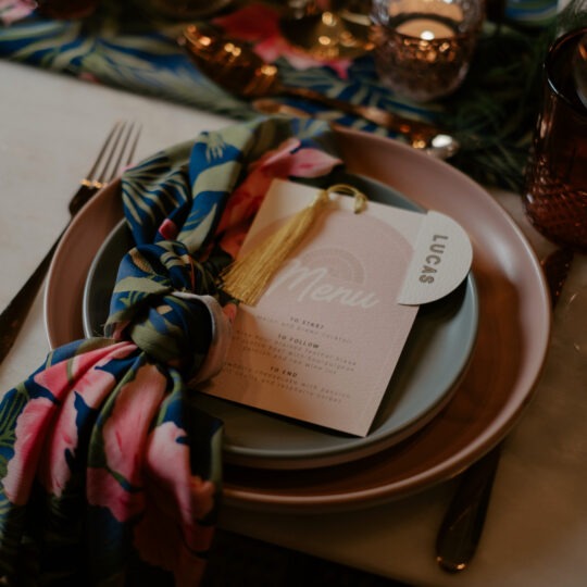
When it comes to the shape of your Menu, gone are the days of the classic rectangular style. Art Deco is making a comeback, with couples playing around with arch shapes to create stationery that is unique and eye-catching.
The shape and design isn’t the only important thing to consider. Your Wedding Menu speaks to guests on your behalf, so it’s important that it’s clear and creative. Don’t fall back on the generic ‘starter’, ‘main course’ and ‘dessert’. Think about how else you could phrase it and consider the full journey like Love Paper Co.
Near & Far
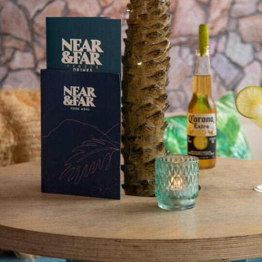
When designing your drink Menu, don’t tuck it away behind the food – give them their own menu. Separating your Menu’s, gives you more space to let your tasty dishes and drink concoctions shine.
Although these are separate Menu’s, branding consistency is key. Be mindful about using complimentary colours, a consistent typeface and tone of voice. If you’re looking for a good example, Near & Far have nailed it with this Folded Menu duo.
St Vincent
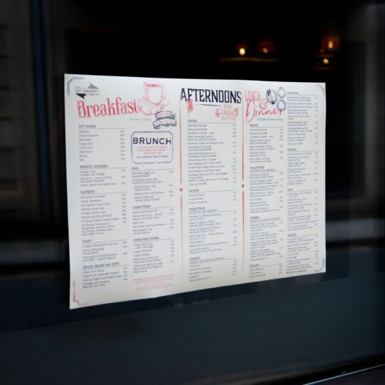
Giving your diners lots of food and drink options is great, but it can be a bit of a head-sore for the person designing the Menu. How can you pack so much information into such a little space?
Make it easy for customers to search for dishes by arranging items sequentially and in logical groups. Also consider adding illustrations to give the diners eyes a break. This St Vincent Window Menu features decorative frames, vintage drawings and pointing hand graphics. These embellishments set the tone by giving a nostalgic, old-fashioned diner vibe.
Hollie Bruce Designs
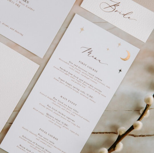
Add a foiled finish to your Wedding Menu and prepare for love at first sight. Inspired by desert landscapes and clear starry skies, Hollie Bruce Designs Menu design features tiny foiled moons and stars, perfect for adding a touch of luxury to your tablescape.
Keep your Menu designs simple and think about your typeface carefully. Using more than one typeface to distinguish the names and descriptions will help to guide customers effortlessly through the tasty options.
Four Side Vegan Pizza
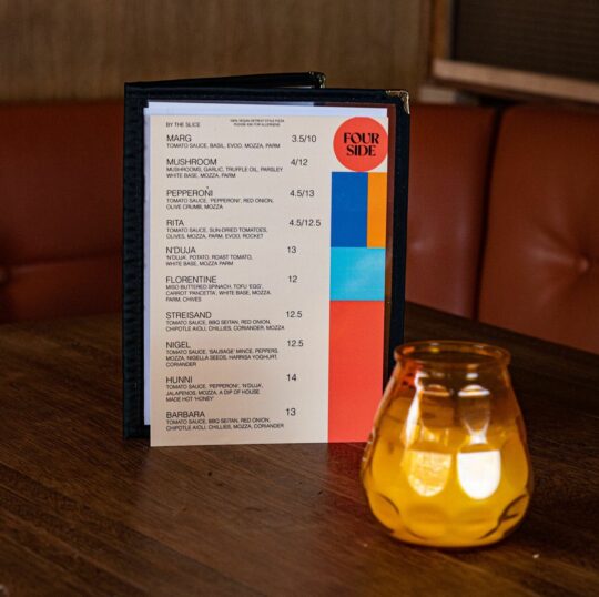
Your brand has a personality. It looks a certain way and it talks a certain way. This is how your customers emotionally connect with your business. Vegan pizza joint, Four Side Pizza, aren’t afraid to show off their fun side with their pizza names and abbreviations. There’s not many places where you can ask to order a Nigel and get a cheesy slice of tastiness turn up!
Bringing in your brand colours, logo and typeface is important too. From branded pizza boxes to the outdoor signage, all marketing materials are consistent and tell the same delicious story.
To make sure your customers dining experience is perfect every step of the way, make your food and drink offering look irresistible with our printed Menus.
