Inspiration, Tips and Advice
The ultimate guide to Brochure design
When it comes to Brochure design, we’ve seen it all. And we know that as a business owner, you will often be looking into new ways to help advertise your products and services. A Brochure is an absolutely timeless marketing staple, and if you’ve been thinking about creating your own you’ve definitely come to the right place.
The following guide to Brochure design has everything you need to get started. From which type of Brochure is right for your business, to copy and content ideas, to our own tips and tricks- it’s all here. So let’s get started!
Which Brochure is right for me?
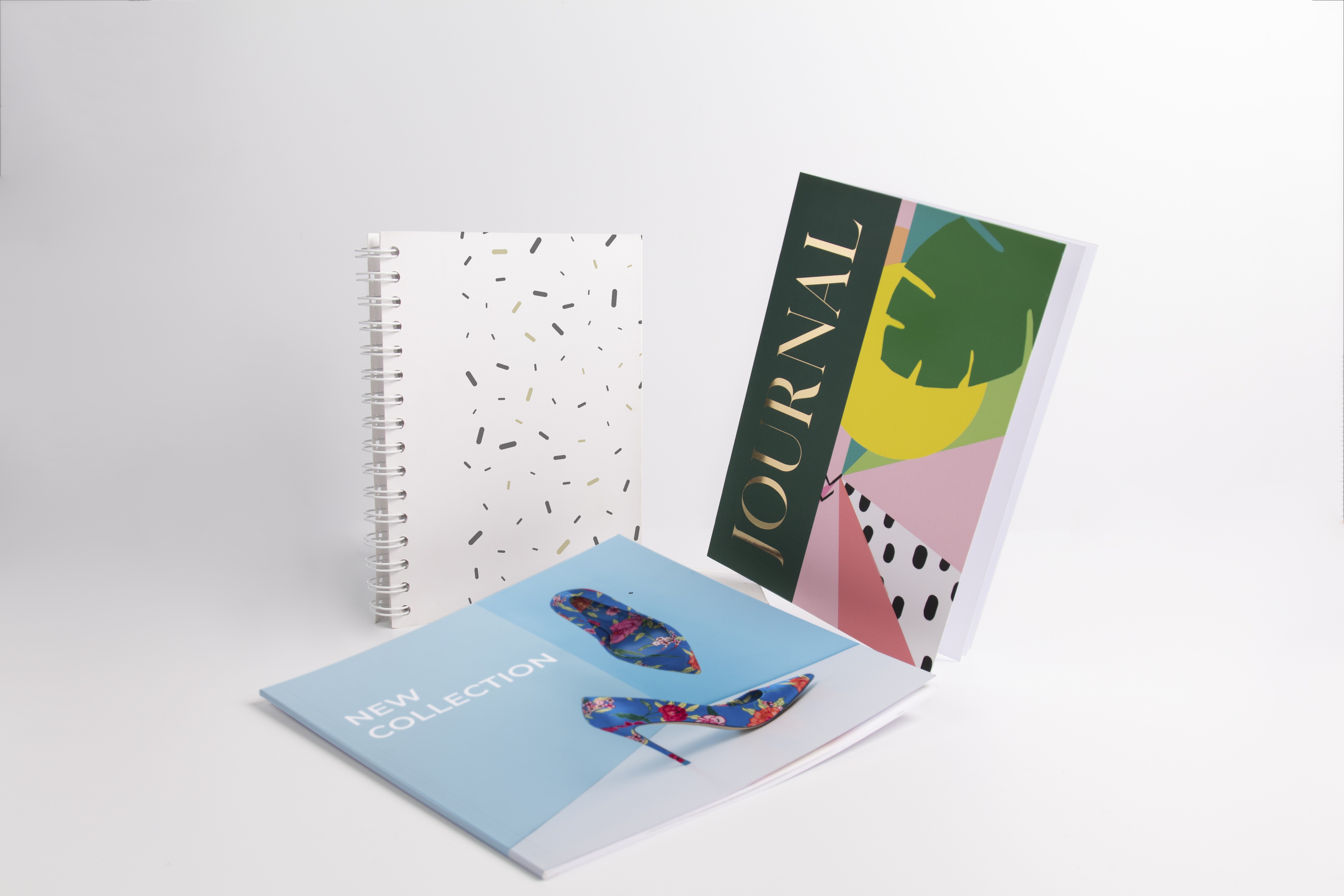
Brochures are also often referred to as lookbooks, pamphlets and even zines. Each type of Brochure is unique, and can be used for a whole range of projects. We’ve explained a few of the more popular choices below:
A Saddle Stitched Brochure is small but perfectly formed. Ideal for documents of 8-40 pages, it’s held together with Saddle Stitched binding (strong staples along the spine) and is the ideal canvas for a catalogue or Menu.
Perfect Bound Brochures are the ultimate choice for documents of 20-400 pages. If you’re looking to create high-impact, glossy magazines or booklets that are on the thicker side, this type of binding is ideal.
A Wiro Bound Brochure is a popular choice for creating products like Brand Notebooks, dissertations and manuals. Pages move freely thanks to this binding, and it’s ideal for presentation documents due to its neatness.
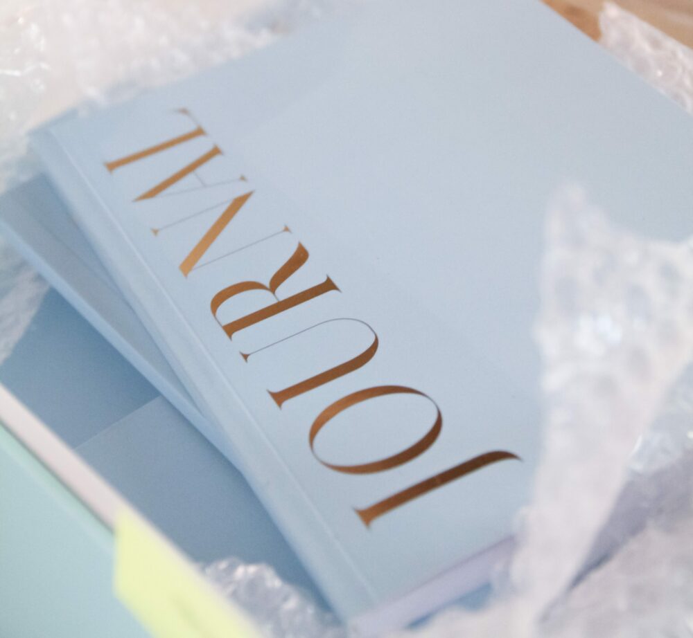
Hardback Books are the pinnacle of luxury when it comes to Brochure printing, and are created through a specialised case binding method. With the option of 32-400 pages, you can really bring your Brochure to life and it will stand the test of time.
Folded Leaflets are essentially mini printed booklets. So if you’re creating a newsletter, price list, or any high-impact piece of marketing, they are ideal as you can make every batch unique.
If you’re still not quite sure which Brochure type is right for you, check out our handy blog here to help you decide. We also have a range of free templates which you can experiment with to find the right fit for your project.
Organising your Brochure design
Before you get started on your Brochure design, it’s important to do some prep. In an ideal world you will have all your content and imagery ready before beginning the design process, so below are a few useful stages to help you get it just right.
Establish your purpose
What is your Brochure for? Are you promoting a new selection of products? Showcasing an updated services list? Or presenting all of your top offers in one place? Decide exactly what your Brochure purpose is and create a simple plan. This will help guide both your copy and visuals.
Decide circulation tactics
So you know what your Brochure is promoting, but where will you distribute them? Whether they adorn a table at your next Exhibition stand or find they way into each of your online order packages. Establishing the ‘where’ will play a key part in your design considerations, including document size options and paper stocks.
Put the client first
It’s all very well and good filling your new Brochure with all your latest news and products, but it’s important to not lose sight of who your Brochure will be consumed by. Keep your customer at the very centre, taking into account their values and requirements. Depending on your type of business (and your budget!) you may decide to create a number of different versions of your Brochure design to appeal to different customer sectors.
Section out your content
Taking into account the Brochure’s purpose, circulation and intended audience(s), you can now begin drafting your content. It can be useful to start with separating out a few sections initially and then build upon these. If, for example, you are showcasing your Photography portfolio, you may likely split this into different sectors such as Wedding, Corporate, Events, Family Portraits etc. A contents page at the beginning can help your customer flick to the section most relevant to them.
Create copy that engages
When you draft your copy make sure to craft the message in a way that will entice the reader to act. This is your chance to put your value proposition front and centre. Speak directly to your client and tell them how your products and services will solve their problem. Even consider adding a QR code for easier access to your web page or social media accounts, so that you can capture them then and there.
Source quality imagery
The most important part of any good Brochure design is, of course, the visuals. This is a real opportunity to showcase everything your business has to offer to keep your customers flicking through the pages. Make sure to select the very best images and graphics for your Brochure, and ensure that there is a synergy between them. As a rule of thumb your images shouldn’t be any less than 300dpi (dots per inch), and make sure that they are bright and clear.
Creating your Brochure
Once you have all your content and imagery ready you can get going on the design layout. When creating your design, the following points can help make sure you get it right.
Is your Brochure a suitable size?
Have you chosen a suitable template? You may decide on a formal A4 document, or choose something a little different such as a square or DL shaped Brochure. From the big to the small, the choice is up to you – just make sure it’s practical and suits your core purpose.
Is the design well-balanced?
Have you aligned your text throughout? Do you need to cut down any areas of copy to keep things clear and simple? It’s also useful to triple check that you don’t have too much text close to the middle fold area of your document (which could be cut off during printing).
Is there flow to your content?
Your content needs to be easy to digest, so make sure that you’ve used a legible font and that any background colours compliment your text and imagery. It can be a good idea to limit yourself to 2-3 fonts to avoid making your design too busy, and decide on a colour palette that is repeated throughout.
Have you left enough blank space?
Good Brochure design leaves a bit of space around content and copy so that the viewer can scan easily. Using margins can be helpful to avoid your layouts touching the borders of your design. Don’t feel like you need to fill every empty space!
Leaving a lasting impression
Once you’re happy with your Brochure design, you’re ready to hit the press! But before you do, we’ve added a few further considerations below, to help you leave a lasting impression on your clients.
Go Bespoke
With our Bespoke service, we can help you create any size Brochure you like. So if you’ve got an extra-special idea that’s a little outside of the box then we’re passionate about helping you create it. Just get in touch via our quick form and we’ll get back to you as soon as possible.
Special Finishes
When it comes to unmistakable print, we have it all at Printed.com. With our Bespoke service you can add Foiling to your Brochure covers, to really add that extra something. Our range of extra Special Finishes can help you create a custom print like no other (and who doesn’t love a bit of sparkle?)
Luxury Papers
If you’re really looking to wow your customers with your next Brochure, then our Luxury Papers have the answers. Chosen specifically for their unique textures and finishes, give your Brochure an extra dose of opulence with these stocks. Discover more here.
And there you have it! Now you know everything there is to know about Brochure design and how to get started. Ready to create your own?


